My New Pens

So earlier this month one of my most favorite fountain pens died. I think I killed it: twisted the piston fill too hard. It jammed. When I tried to unjam it, something broke.

pens & blotter All the king’s horses and all the king’s men couldn’t put Humpty Dumpty together again, and I couldn’t fix my pen either.

Hope didn’t spring eternal, but it did froth and bubble for a while. I Googled “Pelikan pen repair” — the broken pen was a Pelikan 200 — and corresponded with an authorized Pelikan pen repair outfit.

My injured pen, it seemed, could not be easily or cheaply fixed.

I faced the music, or bit the bullet, and consigned my dear trusty amber Pelikan 200 demonstrator model to the wastebasket.

Sniff.

Now, as I’ve written several times before, I have more fountain pens than any girl — even one who does all her first-drafting in longhand — needs. This was still true. I had eight pens filled with various colors of ink and ready to go. I only have two hands, and of the two only one can write legibly. The goddess Durga might make use of eight pens simultaneously, but not me.

But late one night, when desire was strong and inhibition weak, I wandered toward eBay, whence most of my pens have come. A “Christmas model” Pelikan 200 was up for bids, the price was reasonable, and the auction closed within the hour. “Christmas model” did not mean garish. The cap was translucent red, the body translucent green, but you have to hold them up to the light to see the color clearly.

I have given myself away. The eBay screen did not tell me this. I learned it later.

To make a long story short, I bid, and bid again, and bid yet again. The closing price wasn’t quite as reasonable as it had been when I logged on, but it was still pretty good. The pen was mine. (It’s the top one in the photo. See what I mean? It’s not garish at all. It’s currently filled with green ink.)

Well, there’s something about eBay that’s just a little bit compelling. Once upon a time a friend gave me a scratch ticket as a birthday present. I got totally hooked. I lost less than ten bucks before I realized I was in over my head and got out of the pool. I checked out other Pelikan 200 auctions that were closing in the next day or so. I put a couple of them on my watch list.

An email reminded me the next day that one of the auctions had only an hour to go. A-OK. I was working away on my laptop. I opened my browser, went to eBay, and found the auction.

Another long story short: I snagged it, at an even better price. It’s the bottom one in the photo. It’s filled with the plum-colored ink that you can see on the blotter. I’d never used this particular plum-colored ink before. It seems to have been waiting for this particular pen.

Now, of course, I’m haunting the Fahrney’s website for new ink colors.

And so it goes.

Frugal is good. I’m frugal to a fault. But self-denial gets old if you’ve living on a shoestring, and it has its way of bursting into extravagance when least expected. Deny yourself ice cream and pretty soon you’ll be able to think of nothing else.

My theory is that the occasional self-indulgence makes living on a shoestring not only bearable but fun. Every once in a while it’s OK to act as if price is no object, even if it is.

Some Blogs I Like

My m/other blog, my first blog, From the Seasonally Occupied Territories, is read mostly by non-bloggers. Soon after I launched this blog last winter, it started attracting followers who had blogs of their own. Before the end of its second month, Write Through It was Freshly Pressed — featured in WordPress’s ongoing “best of WordPress” feature.

Wow.

I tried to check out the blogs of every blogger who followed Write Through It and every blog that was Freshly Pressed. I was quickly overwhelmed. I cut back and cut back and cut back some more. I still subscribe to more blogs than I can keep up with. All I can say is — there’s an awful lot of good stuff out there.

Several bloggers have nominated Write Through It for various blogging awards or otherwise let me know that they like this blog. Thanks especially to creativewriter, Tempest Rose of Nonsense & Shenanigans, and Susan J. Kroupa.

Rather than nominate other bloggers for awards, I’m listing here a few blogs that I like, along with a few words about why I like them. Not only do I read them regularly, they help keep me going — which is one of the things Write Through It is about. This is nowhere close to an exhaustive list, and it won’t be my last list either. Be warned.

In no particular order:

Off the Beaten Path: Hikes, Backpacks, and Travels: Westerner54, aka Cindy, shares her hikes and travels in glorious photographs and commentary. She’s based in Montana and roams through areas where I’ve never been and probably never will go. (Maybe it’s because I live on Martha’s Vineyard, maximum elevation about 350 feet, but I’m awestruck by mountains.) She shares her knowledge of the places, the flora, and fauna, and her love of the places she visits is contagious.

Speaking of place, the blogger behind Cochin Blogger lives in Kerala, India. His photos, vignettes, and occasional book reviews offer an ongoing introduction to another place I’ll probably never get to.

In Across the Great Dividejournalist Charlie Quimby blogs (all too infrequently these days) about volunteering in a homeless shelter’s preschool. His wonderful first novel, Monument Road, was published late last year. Its vividly evoked characters shape and (more often) are shaped by the less-than-hospitable place they live in — western Colorado.

You may notice a theme emerging here. I’m drawn to blogs that pull me into places and lives I don’t live. This is also true of Charlotte Hoather’s blog. Charlotte is a young woman training to be a classical singer at the Royal Conservatoire of Scotland and aspiring to go on to opera school. She’s got a glorious voice, writes wonderfully, and takes great photos of the places she visits and performers. She recently released a recording of some favorite songs. Of course I bought and downloaded it. It’s excellent.

How to describe Nonsense & Shenanigans? Let’s see: Tempest Rose blogs about daily life, the universe, and being the bipolar (maybe) mother of a young son whose father is in prison. She’s observant, honest, witty, snarky, provocative, and fun. She’s also incredibly prolific. No way I can keep up with her, but I jump into her swift-flowing stream pretty often and always come out refreshed and inspired.

Evelyne Holingue is a French-American writer who blogs about writing, publishing, and traveling, among other things. She’s particularly attentive to the ways cultures and mores combine and collide, a topic that fascinates me too. This is a main theme of her brand-new YA novel, Chronicles from Château Moines, which I’ve just downloaded and started to read. It’s about a California middle-school student who moves to Normandy and has to make a life for himself in a new country and a language he isn’t quite fluent in. Evelyne blogs in both English and French. The French I read slowly and with dictionary at the ready, but it’s one of the attractions of this lively and wonderfully written blog.

And, finally, the Writer Site blog also focuses — surprise, surprise! — on writing, particularly memoir. Blogger Luanne reviews memoirs and is working on one of her own. She blogs about writing, publishing, and other aspects of a writer’s life — and very well too.


Whatever Works

Are you a “plotter” or a “pantser”? For many writers this is a far hotter topic than liberals versus conservatives, dogs versus cats, or Macs versus PCs. Plotters work it all out in advance. Pantsers — you’re way ahead of me here — fly by the seat of their pants.

The other day I learned about “swoopers” and “bashers.” Swoopers dive in and write write write till they run out of steam. Bashers knock each sentence into shape before they move on to the next. Their first drafts are polished and almost ready to go.

Some how-to guides emphasize planning. If you fly by the seat of your pants, they warn, it’ll take a lot longer. You may never finish at all.

If you’re writing to a deadline, whether imposed from without — say there’s a contract involved — or within — say you’re participating in NaNoWriMo and trying to write a novel this month, time is of the essence and “longer” is a liability.

I’m not writing to a deadline, beyond producing a few new pages for each week’s meeting of my writers’ group, but there’s no question in my mind: planning has its uses. Last spring my novel-in-progress (working title: The Squatters’ Speakeasy) ran out of steam. It was all sprawl and no trail. I pushed it to one side and went to work on Wolfie, the current project. Eventually I diagnosed the Squatters problem as a “surfeit of subplots.” There wasn’t a main plot in sight.

Some planning is clearly called for.

At the same time — Wolfie started as one of those multitudinous subplots. It appeared when I was flying by the seat of my pants. It’s taken on a life of its own.

Planning has its uses. So does flying by the seat of your pants. So do swooping and bashing. Whatever works — and when it stops working, try something else.

steering coverAs usual, Ursula K. Le Guin got there long before me. Her Steering the Craft (Portland, OR: Eighth Mountain Press, 1998) is my favorite how-to book. Sometimes I open to a page at random, as if I were casting the I Ching or laying out tarot cards. The other day I was flipping through looking for advice on plot. This is what I found:

“Somebody asked Willie Nelson where he got his songs, and he said, ‘The air’s full of melodies, you just reach
out. . . .’ The world’s full of stories, you just reach out.

“I say this in an attempt to unhook people from the idea that they have to make an elaborate plan of a tight plot before they’re allowed to write a story. If that’s the way you like to write, write that way, of course. But if it isn’t, if you aren’t a planner or a plotter, don’t worry. The world’s full of stories. . . . All you need may be a character or two, or a conversation, or a situation, or a place, and you’ll find the story there. You think about it, you work it out at least partly before you start writing, so that you know in a general way where you’re going, but the rest works itself out in the telling.”

About her “steering the craft” image, which organizes the book (and which I love), she adds: “The story boat is a magic one. It knows its course. The job of the person at the helm is to help it find its own way to wherever it’s going.”

In Wolfie the other day, my main character, Shannon, was sailing along on course. She knew where she was heading. Then two things happen, boom, boom, one right after the other. The first shakes her certainty; the second tells her she’s heading in the wrong direction. She’s got to do something, but she doesn’t know what.

I generally depend on my characters to tell me what’s what. I was no help — but I’m at the helm and lingering in irons in the middle of the bay is not an option.

So I picked out a pen that hadn’t seen much use lately and filled it with red ink. (For days I’d been cruising in more somber colors — gray, brown, black cherry. Red woke me up.) With a sheaf of my new blank paper in my lap, I slipped into Shannon’s head and we wrote, and wrote, and wrote. Now she knows what she’s going to do, and I’ve got a pretty good idea. We’re back on course.

Red ink collage

Red ink collage

Blank Paper

I do most of my first-drafting in longhand. In pen and ink. It works for me. I’ve even blogged about it.

My fleet of fountain pens

My fleet of fountain pens

It does present certain challenges, however. The near-illegibility of my handwriting I’ve managed to turn into an asset: what the internal editor can’t read, she can’t second-guess and mess with.

Most commercially available paper, I discovered, can’t stand up to fountain pen-and-ink. Yellow pads, notebook paper, the bond paper I feed to my laser printer and my inkjet: they’re all so thin that what I wrote on one side made an impression on the other.

This might not be a deal-breaker for some people, but I’m cheap. I want to write on both sides.

I was also looking for a way to organize my handwritten pages. Browsing at a office-supply chain store, I found these cool notebooks. They were looseleaf, sort of, but instead of two or three big metal rings, they had eleven little plastic ones. You could add pages, remove pages, or move pages around.

I bought one notebook and the filler paper to go with it. Wonder of wonders, I could write in fountain pen on both sides of the paper, and the words all stayed on their own side.

I was hooked. Now I’ve got three notebooks: a blue one for Wolfie, the novel in progress; a red one for Squatters’ Speakeasy, the novel on the back burner; and a brown one for everything else.

Wolfie has been eating up paper like nobody’s business. I scavenged paper from the red and the brown notebooks to put in the blue one. Then there was no more to scavenge. I was almost out of paper.

paperI hesitated. Blank paper is a challenge. Am I going to keep writing? Yeah, I thought. I am.

How much paper should I order? This was harder. Like I said, I’m cheap. I hate to spend money on stuff I don’t use. Sooner or later any blank paper left untouched on the shelf would be making faces at me and going “Nyah nyah, nyah nyah.”

I ordered five packets, 50 sheets to a packet — 500 sides of fountain-pen-friendly paper. And some section dividers to go with them.

Blank paper is faith in the future.

Ready to write

Notebooks with section dividers and sticky notes

New Look!

OK, I stopped fiddle-faddling and went with Hemingway Rewritten. Well, I haven’t totally stopped fiddle-faddling, because I’m still playing with background colors and widgets and thinking I want to redo the pages on the menu bar and maybe get a new header photo?

Later!

really like having a sidebar.

Let me know what you think. I especially want to know if you find it unreadable — because of the fonts, or the sizes, or the colors.

New Theme TK

Write Through It is going to get a new look — as soon as I can make up my mind, that is. I like this theme, not least because of its name (“Typo”), but I want a sidebar. Readers are having a hard time finding the archives, the “recent posts” list, and the search bar because they’re way down at the bottom. I’d also like “Leave a Comment” to be more visible.

The theme of my dreams has got to be free. The ones I’m considering are Twenty-Eleven, Hemingway Rewritten, Yoko, Mystique, and Misty Lake. Dear readers who are also WordPress bloggers, do you have a favorite theme that I should have a look at? Do you have any feelings, pro or con, about the ones I mentioned?

All comments welcome!

Hyphenalia

Policy maker, policy-maker, or policymaker? Pre-eminent or preeminent? First grader or first-grader? E-mail or email?

Hyphens can be tricky, but that's no reason to tear your hair out.

Hyphens can be tricky, but that’s no reason to tear your hair out.

According to Sturgis’s Law #5: “Hyphens are responsible for at least 90 percent of all trips to the dictionary. Commas are responsible for at least 90 percent of all trips to the style guide.”

The tricky thing here is that the dictionary will only tell you what to do if your word is in there. Often it isn’t. If it is, you’re in luck — as long as you don’t notice that (1) dictionaries are wildly inconsistent when it comes to hyphenation, and (2) dictionaries often disagree with each other.

Merriam-Webster Unabridged doesn’t list “policy-maker” or “policymaker.” This may be taken to mean that MW considers it two words: “policy maker.” The American Heritage Dictionary, however, lists “policymaker” as one word, no hyphen. And while we’re at it, MW thinks “policyholder” is one word. “Slaveholder” is one word, but “slave owner” is two.

For several editions now, the Chicago Manual of Style has been trying to impose method on the hyphenation madness. In section 7.85 of the 16th edition you’ll find a handy-dandy several-page chart. It sorts compounds by category, parts of speech, and specific words; gives examples of each subcategory; and then summarizes the “rule.”

It’s useful, it really is. I refer to it often. But it too will lead you into inconsistency, not least when you notice that British English uses hyphens more liberally than American English and the sky hasn’t fallen in yet. Chicago “prefers a spare hyphenation style.” So do the Merriam-Webster dictionaries. The operative word here is “style.” In matters of style, there’s generally a big gray area where choices have to be made.

What editors and teachers and style guides tend to forget is that hyphens serve a purpose — beyond driving editors crazy, that is. Hyphens are joiners: they link words into temporary compounds and attach prefixes and suffixes to root words. Over time temporary compounds may become permanent if they’re used enough. A few years ago “e-mail” was generally hyphenated, but these days it’s often one word: “email.”

“Policy maker” and “policy making” are in transition. That’s why one dictionary makes them two words and another closes them into one, and you’ll sometimes see “policy-maker” and “policy-making.” I suspect that the words are closing up fastest among people who write about public policy. They and their readers think of “policymaker” as one word, not two.

If you read books that were published a century, or even a few decades, ago, you’ll probably find hyphens where they’re seldom found today. “Rail road” was once two words, then it was hyphenated, then it fused into one: “railroad.” Other compounds have split into two distinct words: “no-one” is still out there, but “no one” is now standard. The hyphen is no longer needed to tell readers that “no” and “one” are a unit.

What if the potential for confusion still exists? That’s part of the gray area. A readership of educators and parents of young children will probably realize at first glance that a “first grader” is a kid in first grade. A more general audience might need a little help. I generally hyphenate “first-grader” myself, but when I’m editing, I’ll nearly always go with the author’s choice.

How about “high school student”? Yes, it is possible to read that to mean a school student on drugs, but this generally involves some contortion on the reader’s part or (more likely) an affection for puns. If your readers are familiar with the term “high school,” you can safely omit the hyphen.

Once in a while, though, the little hyphen is crucial. Chickens live in a coop; people buy food at a co-op. Newspaper columns are op-eds (an abridgment of “opposite the editorial page”), not opeds.  Merriam-Webster’s hyphenates “co-ed” as both noun and adjective; American Heritage says it can go either way: “co-ed” or “coed.”

Which brings up another handy thing about hyphens: they can join, but they can also separate. In “co-op,” “op-ed,” and “co-ed,” the hyphen tells you to read or pronounce each word as two syllables, not one. This is why plenty of writers use a hyphen in words like “pre-eminent”: to signify that “pre-” is a prefix and that the first syllable of the word is not “preem.”

Merriam-Webster’s and Chicago don’t like such hyphens, so rule-following copyeditors routinely strike them out, whether they’re useful or not. I don’t know about you, but I can’t look at “reignite” without seeing “reign-ite” or “coworker” without seeing “cow-orker,”  so I’m inclined to deal with hyphens on a case-by-case basis. Be wary of “one size fits all” rules when it comes to hyphens, or anything else for that matter.

A hyphen between prefix or suffix and root word can also subtly call attention to the root. The authors I edit often hyphenate “pro-,” “anti-,” and “non-” words. Whether they’re doing it instinctively or by choice, I suspect this is why they do it — because I do it myself. To me “pro-choice” is stronger than “prochoice,” “anti-liberal” than “antiliberal,” and so on.

The author of a current copyediting job hyphenates “desert-like.” Chicago says “-like” compounds should be closed if they’re closed in Webster’s, and sure enough, “desertlike” is given in the entry for “desert.” Is that a good reason to close up “desert-like”? I don’t think so. “Desert-like” calls a little more attention to “desert,” and the passage it’s part of is a little more vivid as a result. So I entered “desert-like” on my style sheet, so the proofreader will realize it’s intentional, and moved on.

Hyphens are handy, versatile little buggers. Sure, they can be overused, but so can anything else.  Do learn whatever conventions prevail in your field or genre, but don’t worry about hyphens when you’re first-drafting. Even if the whole world will think you’re stupid because you put a hyphen in the wrong place, you don’t have to worry about it yet. Not until you’re ready for the whole world — or at least your writers’ group, or an editor — to have a look at your ms.

When you get to your second and subsequent drafts, that’s soon enough to think about whether this or that hyphen serves a purpose.


Of Dots and Dashes

Dashes and ellipses. Many editors don’t like them. Dashes and ellipses take up space. They call attention to themselves. And they’re often overused: writers may resort to dashes and ellipses when they can’t figure what else to do.

But dashes and ellipses are handy critters. Used with care, they’ll help you shape your writing to say what you want and sound the way you want it to.

First off, what are they?

An ellipse consists of three periods in a row. (In British English, periods are called full stops.) Like this: . . .

There’s a space between the dots, and one at each end. What your word-processing program calls an ellipsis looks like this: … No spaces between the dots. If you want to score brownie points with your editors and your more discerning readers, don’t use this shortcut. Type dot-space-dot-space-dot.

The ellipsis serves an important purpose in academic and other nonfiction: when you’re quoting from another source and you want to abridge the quote, the ellipsis is used to indicate where words have been left out. Say I wanted to quote the second sentence in the second paragraph of this post but not all of it: “Used with care, they’ll help you shape your writing to say what you want and sound the way you want it to.”

I’d render it thus: “Used with care, they’ll help you shape your writing to . . . sound the way you want it to.”

Important resources for learning more about ellipses, dashes, and other stuff

Important resources for learning more about ellipses, dashes, and other stuff

Aside: Leaving words and whole sentences out of quoted material can distort and misrepresent the original author’s intent. Use ellipses with care. For more about this use of the ellipsis, consult your favorite style and grammar handbook.

In fiction and non-scholarly nonfiction, the ellipsis indicates a trailing off. Words are being omitted not because they’re being dropped from a quotation but because they aren’t being said.

Here’s a snippet from my novel in progress. Giles and Shannon are friends. Wolfie and Pixel are dogs. Giles is meeting Wolfie for the first time.

Giles was pointing at Wolfie. “Who, or what, is that?”

“This is Wolfie,” said Shannon. “I told you about Wolfie.”

“You did,” Giles conceded, “but I wasn’t prepared . . .” He fluttered his fingers at Pixel, who was lying in the hallway paying close attention.

Giles doesn’t complete his sentence. He shifts his focus — and the reader’s — from Wolfie to Pixel. The reader doesn’t know what Giles was about to say or why he didn’t say it.

In dialogue the dash, in contrast to the ellipsis, indicates an interruption. Here’s an example from later in the same scene. Giles and Shannon are both artists. They’re looking at a wall mural in Shannon’s house.

With his coffee mug Giles indicated a long line across the middle distance. “What this wall needs,” he pronounced, “is some movement.”

“Thank you, Mr. Picasso,” Shannon said. “You could just stand there and direct traffic —” She stopped short. “Aha!” she said, setting her coffee down and joining Giles at the wall.

Shannon interrupts herself. Dashes can also be used when characters interrupt each other. An interrupted sentence sounds different from one that trails off. It’s like the difference between walking into a door because you didn’t see it and slowing down before you get there.

Dashes have other uses too. Like commas and parentheses, they often come in pairs. Note my sentence above:

He shifts his focus — and the reader’s — from Wolfie to Pixel.

The dashes could be replaced by either commas or parentheses:

He shifts his focus,  and the reader’s, from Wolfie to Pixel.

He shifts his focus (and the reader’s) from Wolfie to Pixel.

Or the punctuation could be dropped altogether:

He shifts his focus and the reader’s from Wolfie to Pixel.

I chose dashes on the fly because I heard “and the reader’s” as a very slight detour, a stepping-back from the sentence before following it to the end. If I revise the sentence (which I probably won’t — this is a blog after all!), I might consider the alternatives. Set off by commas, “and the reader’s” is more fully integrated into the sentence, but not as fully as it would be with no punctuation at all.

Set off by parentheses, it becomes an afterthought, as in “Why include it at all?” When I put something in parens, it’s often because I have a sneaking suspicion it doesn’t need to be there but I can’t bear to delete it. The parens are there till I muster the nerve to yank it out.

Now take another look at the paragraph just before the preceding one. There’s a sentence in there that includes a dash and an exclamation point and parentheses all bundled up together. Am I going to warn you “Don’t do this at home”? I am not. I’m going to say “Try it. See if it works. If it doesn’t, try something else.”

No Need to Shout!!

99% of all editors, writing instructors, and experienced writers will tell you: “Use emphasis sparingly.” Emphasis includes ALL CAPS, bold, underscore, and italics. And exclamation points!!!

(OK, 99% is an unverified statistic. I made it up — you know, to emphasize my point.)

This is why our gatekeeper friends will relegate a manuscript to the slush pile if the first couple of pages include too many italicized, bolded, underscored, or ALL CAPPED words and phrases. Fairly or not, they’re leaping to the conclusion that the writer who relies heavily on gimmicks is not ready for prime time.

How many is “too many”? If they’re the first thing a person notices when she pulls your ms. out of the envelope or opens the file, that’s too many. Aim for “none” and you’ll probably get it about right.

“But,” you wail, “how do I show what’s important?”

Good question!

When we speak, we can emphasize words and phrases by speaking them more loudly, or drawing them out, or exaggerating their each and every syllable. We can use our hands and our faces to express our feelings or underscore a point.

You can replicate some of these methods in writing. You can describe how a character said something and/or what she was doing while she said it. Too much description, though, can slow a passage down when you want it to move right along. Lucky for all of us, written English offers some powerful tools to call attention to whatever you want to call attention to. and without using ALL CAPS, bold, underscore, italics, and other gimmicks. Learning to use them is part of the writer’s craft.

So how does one go about this?

Here’s where I advise even non-poets to read lots of poetry. Good poets make every word count. They have to: poems use fewer words than stories, essays, and full-length books. They read their written words aloud and pay attention to how they sound. Poets who work in traditional forms, like the sonnet, use meter and rhyme to emphasize important words. Words at the ends of lines and lines at the ends of stanzas get particular emphasis. And so on.

Prose writers use sentences and paragraphs the way poets use lines and stanzas. Words at the beginning and, especially, at the end of a sentence are emphasized. Likewise sentences at the beginning or end of a paragraph, and paragraphs at the beginning or end of a scene.

Have you ever confronted a paragraph that sits on the page like a dark gray lump? One sentence follows another with no break, maybe for a whole page or more. If the eye gives in to the natural temptation to skim through to the end, the mind is almost certainly going to miss something important.

But there’s no need to bold or italicize the sentence you want to call the reader’s attention to. If that paragraph belongs to you, try breaking it so that your key sentences fall either at the end of one paragraph or the beginning of another. If you’re reading it in a book, identify a place or two where author or editor might have started a new paragraph. (You may not find any such places. It’s possible that the paragraph really needed to be that long.)

I like long loopy sentences, but I also know that long sentences tend to lose energy. So I pay close attention to the words, phrases, and clauses that make them up. When I’m editing, I’ll sometimes break a compound sentence in two in order to focus more attention on each of its parts.

Here’s where the oft-repeated advice to “omit needless words” comes in handy. “Needless words” are the ones that camouflage or otherwise distract attention from the important stuff. What’s tricky is that you have to identify the important stuff before you can decide what’s needless, and this often doesn’t happen till a second or third draft.

The best way to develop your skill at emphasizing key points without resorting to gimmicks!! is by experimenting on your own work, getting feedback from editors and other writers, and giving feedback to other writers on their in-process work. Anyone out there have an example to share with other readers of this blog? Keep it fairly short, say 100 words or so. You can use either the comments link at the top of this post or the contact form in the “You!” tab on the menu bar.


What’s a Style Sheet?

I knew nothing about style sheets when I started copyediting books for trade publishers and university presses. Before long I thought style sheets were the greatest thing since mocha chip ice cream — well, almost.

So what’s a style sheet? More important, if you’re a writer, not an editor, why should you care?

English is a richly diverse language. British English (BrE) and American English (AmE) often spell the same word differently: spelt/spelled, labour/labor, tyre/tire. In AmE, some words can be spelled in more than one way, like ax and axe, or façade and facade. Others have variations that are pronounced differently but mean the same thing: amid and amidst, toward and towards.

And hyphens! Don’t get me going about hyphens. One of these days I’ll devote a whole blog post to hyphens. Sometimes a hyphen is crucial: consider, for instance, the difference between coop and co-op. Often the hyphen is helpful but not crucial. When I look at reignite, the first thing I see is reign. If an author wants to hyphenate it, re-ignite, that’s fine with me. For most readers, the hyphen in living-room sofa isn’t essential, but if the author has written it that way, I’ll generally leave it alone — and insert a hyphen in dining-room table if the author has left it open.

A style sheet collects all such choices into one handy list: choices not only about how words are spelled but about how they’re styled. Hyphenation is often a matter of style rather than spelling. When do you spell out numbers and when do you use figures? Are abbreviations OK? When the dictionary notes that a word is “often capped” or “usually capped,” which does the writer prefer?

It’s a rare author who submits a style sheet with his or her manuscript. A recent job included Arabic and Urdu terms transliterated into English, and many personal and place names that are transliterated in myriad ways. The author did include a style sheet with his preferred spellings and stylings, and I was profoundly grateful. It saved me a lot of online research and second-guessing.

In fact-checking another recent job, a novel, I quickly discovered discrepancies between the names of some real-life places and the way my author was spelling them. Other names were faithful to the actual place. I’m still not sure whether these discrepancies were intentional or not. If the job had come with a style sheet, I would have known — and I wouldn’t have spent so much time trying (unsuccessfully) to verify the author’s versions.

Why should you, the writer, keep a style sheet?

Maintaining consistency in a novel or long nonfiction work is a challenge. Sure, if you’re working on the computer, you can use the search function to find earlier instances of a word or name — or you could just consult your style sheet. If you’re writing a series involving the same locations and characters, a style sheet will be even more useful.

Whether you self-publish or publish with a trade, academic, indy, or small press, your style sheet means your copyeditor doesn’t have to start from scratch. If she finds inconsistencies in the ms., she’ll be able to go with your preference instead of guessing what you want.

Several books that appear frequently in my "Primary References" section

Several books that appear frequently in my “Primary References” section

I find that keeping a style sheet makes me more conscious of my choices, whether I’m editing or writing. Plenty of choices are “six of one, half dozen the other.” Others are a matter of style: for instance, do you prefer diacritics in words like façade and résumé and naïve? And sometimes, especially with proper nouns, it’s a matter of right and wrong. In the very well written nonfiction book I just finished copyediting, Katherine Hepburn’s name was so spelled. I’ve seen it so often (mis)spelled that way, I didn’t have to look it up (but I did anyway): it’s Katharine, with an a. Before you enter a name on your style sheet, verify the spelling.

If you write fantasy or science fiction, with made-up names that can’t be verified online, a style sheet can be especially useful. Same goes if, in either fiction or nonfiction, you’re dealing with names from other languages, especially languages that don’t use the Roman alphabet. Transliteration systems differ. Accents and diacritics and other spelling conventions can be confusing to someone who doesn’t know the language.

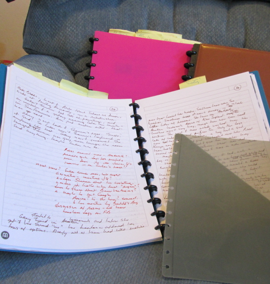
You can organize your style sheet in any way that makes sense to you and whatever you’re working on. Here are the major categories and subcategories in the style sheet I made for a just-completed job, with a brief explanation of each. Most of mine follow a similar format.

Primary References

Here’s where I put whatever dictionaries, style guides, and other reference works I’m using. This keeps my word list (see below) under control: it means I only have to list spellings and stylings that differ from the dictionary’s or style guide’s recommendation.

General

This section is for style choices that apply to the whole book. Number 1 is nearly always “serial comma.” Number 2 usually specifies either “which/that distinction observed” or “which OK for restrictive clauses.” (Anyone want a crash course on the which/that distinction??)

This particular style sheet had subsections for Capitalization, Hyphens & Dashes, Quotes & Italics, and Slashes. Most also have a Numbers subsection, but not this one.

Words

Word lists can be short or long. They should include choices made where alternatives exist, e.g., axe rather than ax, or vice versa. They’ll probably include plenty of words where capitalization, hyphenation, the use of italics, or the styling of numbers is at issue. Their #1 purpose is to help me keep my choices and the author’s straight.

Among the words and phrases in my list were the following (with the reason I included each one):

Braille (can be lowercased)

carpe diem (like other foreign-language expressions listed in the dictionary, it’s usually not italicized)

coauthor (commonly hyphenated)

 decision-making (n.) (decision making and decisionmaking are also possible)

 not-yet-imagined, the (coinage by the author)

 rebbe (variant spelling of rabbi)

transparence (variant of transparency)

Trickster tales (Trickster capped as an archetype)

Western (cultural); western (n.; genre): compass directions are usually lowercased, except when they take on a more-than-geographical meaning. Eastern and Western may signify large cultural groupings. During the Cold War, they had political significance. (North and South are generally capped in reference to the sides in the U.S. Civil War.) And western the genre is sometimes capped and sometimes not. Could drive you crazy, no?

Names

Some copyeditors list the names of virtually every person mentioned in a book. As a proofreader, I don’t find such exhaustive lists useful. So I don’t list familiar names that are easily verified — unless they are frequently misspelled (like Katharine Hepburn) or the author is inconsistent. It can be hard to verify names with particles (von, van, de, etc.), partly because styling varies from family to family and because online references aren’t always as authoritative as they think they are. So it’s worth putting them on the style sheet.

serenity prayer

A good style sheet helps editors and proofreaders recognize what should be changed and what’s fine as it is.