First Workshops

Progress is being made. 🙂

This morning I designed a card for my first offerings. Because I’ve been writing Postcards to Voters since the fall of 2017, and because I like designing my own postcards, I’ve become quite adept with Avery.com and I’ve always got a stash of postcard stock handy. This is what I came up with:

I offered Word for Writers through my town’s library back before Covid, and it went pretty well. Plus I’m always explaining to other writers how Track Changes or some other Word feature works, so even though I’m nowhere close to a Word power user, I’m sure I can do this. (I’m currently taking Allen Wyatt’s online course on Beginning Macros. Maybe when I complete that, I can call myself a Word semi-power user.)

Letters to the Editor — well, I’ve written quite a few in my time, and back when I worked for the Martha’s Vineyard Times I copyedited most of them. The Times publishes most of the letters it receives, and as you might guess, the caliber of the writing varies. My claim to fame was that I generally managed to edit the letters in a way that the writers didn’t realize I’d changed anything. More recently, I’ve been to a couple of online workshops for activists on how to write good letters to the editor (which in activist-speak are known as LTEs). They were pretty useful.

I’m offering two options for each, and who knows whether anyone will show up. I’m thinking of this go-round as dress rehearsals so there’ll be no charge. In future, I’m thinking $20 a pop sounds pretty reasonable.


At last report, I wasn’t expecting the sofa bed I’d ordered to arrive till the middle of the month. Pleasant surprise: it arrived this past Monday morning. I’m very pleased with it. The Wayfair website had said that some assembly was required, which worried me a bit, but the only assembly required was screwing the stubby little legs into the base of the sofa. The bed part unfolds easily.

I’ve also acquired a wastebasket, a wall clock, and a card table (which will only be set up when needed). This is what the room looks like now:

U Is for Undo

My possibilities for U didn’t inspire me at all — usage? uniformity? — then this morning while Tam Lin and I were out walking, “undo” popped into my head. (This is why W is going to be for Walking. Coming up soon! Watch this space.)

My next thought was “Doesn’t undo begin with Z?”

Muwahahaha. If you’re a Windows user who writes and/or edits for a living, you are almost certainly on a first-name basis with CTRL+Z, the keyboard command that will undo most of the awful things you just did. No, it will not bring back the document you accidentally trashed before you’d saved it, but after you’ve done that once, you’ll probably remember to name and save new files as soon as you create them, and tell your PC to automatically back up your work at regular intervals.

If you decide that the awful thing you just undid isn’t so awful after all, CTRL+Y will bring it back. I don’t use CTRL+Y nearly as often as I use CTRL+Z. That probably says more about me than I want generally known, but there it is.

Aside for Mac users: The Mac equivalent is COMMAND+Z. To undo your undo, it’s COMMAND+SHIFT+Z. I can’t verify this at home, but you can if you’ve got a Mac.

CTRL+Z is so much easier than its analog predecessors: erasers, Wite-Out, correction tape, etc. With those methods, undoing your undo was pretty much out of the question. And don’t get me started on correcting a master stencil in the heyday of mimeograph. In case you’re wondering why I wax rhapsodic about CTRL+Z.

If you use Track Changes — as I do when I’m editing, all the time, but not so often when I’m writing — it’s easy to flip back and forth between the original version and whatever you did to it. Even so, CTRL+Z saves my butt on a regular basis.

But really, people, this isn’t just about a handy keyboard shortcut. It’s a reminder that — at least until something’s published, and maybe even then — you can change it, rethink it, revise it.

CTRL+Z is a reminder that you’ve always got an escape hatch, a safety net. Feel free to take risks. Don’t worry about looking stupid to yourself 10 minutes later. You can always undo it.

And if you decide you had it right the first time, you can undo your undo.

Tam waits for me to get done with whatever I’m doing.

Editing on Paper

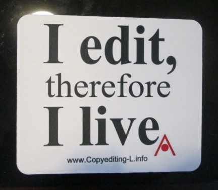
When I started editing for a living, “editing on paper” was about as noteworthy as swimming in water — like what else was I going to edit on — parchment? calfskin?

Now most editing is done on a computer screen. Editing on paper is a novelty. Some editors I know won’t do it. Quite a few of those a generation younger than I, and those who started editing professionally in middle age, have never done it.

I still do it on request. In fact, I just started a paper copyedit for a trade publisher client. It’s a 700-page nonfiction baby, with a short bibliography, no endnotes, and a 65-page “essay on sources.” I’m adequately supplied with red pencils and Post-its, and I still know copyeditor’s and proofreader’s marks as well as I know the alphabet.

My work nook. It’s much more cluttered than it was when I took this picture.

My little workspace — a comfy recliner, a lapdesk with my laptop (her name is Kore) on it, flat surfaces on either side — no longer lends itself to editing on paper. To my left, for instance, is a short row of editorial essentials: Merriam-Webster’s Collegiate Dictionary, 11th ed.; The Chicago Manual of Style (16th ed. — the newer 17th edition is on the floor next to my chair); Words Into Type; and Amy Einsohn’s Copyeditor’s Handbook.

Trouble is, the editorial essentials I use most often — which is to say “continually” — are online. My subscription to Merriam-Webster’s gives me access not only to the Collegiate but to the vastly larger Unabridged.

When I left my first staff editor job — in the publications office of the American Red Cross in Alexandria, Virginia — in (gasp) 1981, my colleagues gave me as a parting gift a copy of the Unabridged, formally Webster’s Third New International Dictionary. It’s far too unwieldy for regular use. It needs to sit on its own lectern, where you don’t have to wrestle it into your lap. This was indeed the setup in the Red Cross publications office: “Web 3” rested on its pedestal at one end of the editorial section and the venerable “Web 2” — Webster’s New International Dictionary, second edition — sat at the other. We editors each had the current edition of the Collegiate (IIRC it was the 9th) in our cubicles.

Arbiters of style, in hardcopy

I also subscribe to the Oxford dictionaries, which include not only British English (BrE) and the U.S. variety (AmE), but several other languages as well (Spanish, French, German, Italian, Arabic, Russian, Chinese, and Portuguese). Oh yeah, and access to Hart’s Rules, a popular BrE style guide, among other useful tools.

The American Heritage Dictionary doesn’t require a subscription for its online edition, though I’d happily buy one if it did because I use it a lot, and about a year ago I finally broke down and subscribed to the online Chicago Manual of Style because they were offering a good deal when the 17th edition came out in print.

You can imagine how much space all these reference books would take up in hardcopy, and did I say that I live and work in a studio apartment? Not to forget the geographical, biographical, and bibliographical resources that I use for routine fact-checking. My style sheet for a just-completed job included six and a half single-spaced pages of personal names alone, every single one of them verified by me. In the pre-digital days, I would have required access to a research library to accomplish this, and it wouldn’t have been expected: a common publisher’s guideline for copyeditors runs something like “check facts as long as it doesn’t add appreciably to your billable time.”

The digital age has contributed to considerable mission creep on this one. Checking names, dates, and even quoted material doesn’t add appreciably to my billable time, so I do a lot more of it than I did in the old days. The big challenge is keeping it from adding appreciably to my non-billable time. From childhood I’ve been one of those people who goes to look something up in a dictionary or encyclopedia, falls down the research rabbit hole, and emerges an hour or two later having learned all sorts of neat stuff that may or may not include whatever I was looking up in the first place. The World Wide Web laughs at “billable time.”

Social media is, if anything, even worse. I belong to several editing-related groups on Facebook. This is where I go to find answers that aren’t in the dictionaries or style guides, like “Is this sense of ‘set off’ common in the U.S.?” Pretty soon, though, I’m responding to another editor’s query, or checking up on breaking news, or reading an interesting commentary that a friend recommended. Rabbit holes and looking-glasses everywhere!

Gizmo with beer can. I have been a T. E. Lawrence fan since I was about 9. My taste for beer is relatively recent.

So when I edit on paper, Kore the laptop sits on her lapdesk on the floor at my feet, usually with the lid closed. To wake her up every time I want to check a name or date would absolutely add appreciably to my billable time and wreck my concentration too. So I flag the things I want to look up on Post-it notes and do it all in batches.

For access to dictionaries, I use Gizmo, my little tablet. I guess I could use Gizmo for fact-checking too, but the small screen and the virtual keyboard are not my friends, so I don’t.

Logging words, names, and style decisions in my style sheet is likewise clunkier when I edit on paper. (Aside: If you aren’t on a first-name basis with style sheets, check out my 2014 blog post on the subject: “What’s a Style Sheet?” You may already be keeping one without calling it that. When it comes time to work with an editor, your editor will be seriously impressed if you give her/him a style sheet. Trust me on this. )

When I edit in Word, it’s easy to flip back and forth between manuscript and style sheet, and to copy and paste words and names from one to the other. When editing on paper, I start my style sheet on paper, then when Kore’s back on my lap for a look-up session I create a Word file for it, print it out, log new words and style choices on it as they come up, then add them to the Word file at the next opportunity. And repeat, repeat, repeat till the job is done.

Word processors make style sheet maintenance so much easier because they can alphabetize long lists in a second or two. (I’m not going to even try to explain the grid system many of us used in the old days.) But once you’ve edited electronically, the biggest drawback of going back to paper is the lack of CTRL+F (Command + F on a Mac): the Search function. Once upon a time, if, say, the spelling of a name seemed slightly “off”, I could often find the earlier spot where it was spelled differently, even if I hadn’t noted the page number in my style sheet. Thanks to CTRL+F this facility has largely, though not completely, atrophied. I can now confirm my hunches in seconds. If I want to change an earlier style choice (often about hyphenation or a variant spelling), I can easily revisit and revise all previous instances.

So when I edit on paper, the publisher’s production editor provides an electronic copy of the manuscript. I edit on paper, but I search in Word. The same goes for proofreading: I generally mark up the hardcopy, but I have the PDF on my laptop in case I need to search, which I will, multiple times, before the job is done.

Back to Wolfie World

OK, I’m back — I think.

This morning I got back to Wolfie.

Postcard from Mary Likes Postcards. Check out her Etsy shop — lots of good stuff!

Word, which never lies (though it rarely tells the whole truth either), told me that I’d last opened the file on October 2. That sounds about right. That’s when I pushed it aside to focus on doing my bit for the Blue Wave while completing enough paid work to buy groceries, pay the rent, and rationalize the campaign contributions I was putting on my credit card.

Despite some high-profile disappointments, the Blue Wave was pretty spectacular. How spectacular wasn’t immediately obvious, but it was looking pretty good when I gave my “Post-Election Pep Talk” a couple days after the election.

In November I busted my butt to meet deadlines that wouldn’t have been so pressing if I’d done more work and less politicking in October. Now the deadlines are mostly met, accounts receivable are up, and the political outlook is brighter than it’s been in two years, so it’s all good. At the beginning of the month I swore off buying beer till I’d paid down my campaign-related credit card debt. I didn’t miss the beer as much as I thought I would; the campaign-related credit card debt is, if not quite liquidated, then well under control; so that’s pretty good too.

So this morning I finally got back to Wolfie. I didn’t do any writing — after two months away I had to get reacquainted first. I’m maybe two scenes away from finishing draft 3, which was a dangerous place to leave off. Drafts 1 and 2 didn’t go through to the end because until I was well into draft 3 I didn’t know how it was going to work out. Well, that’s not quite true: I had a good idea of how I hoped it would work out, but I didn’t know how my characters were going to get there.

Before I put Wolfie aside to devote more time and creative energy to politics, a promising path had appeared. Whenever I thought of getting back to it, a seductively sensible inner voice said, “Why bother? Your characters have figured it out, you know what’s going to happen, why waste your time writing it?”

Compounding that — well, with the country in desperate straits, how could I possibly justify spending hours upon hours upon hours on completing a novel that only a handful of people will ever read?

Word, which never lies, tells me I’ve so far spent 14,988 minutes on Wolfie since the file was created on March 20, 2017. That’s about 250 hours. Once again, however, Word isn’t telling the whole truth because I’ve been working on Wolfie for considerably longer than that. I started draft 3 on March 20, 2017. I could open the hibernating files for draft 1 and draft 2 and learn how many minutes I spent on each, but no, thanks anyway, I’d rather not.

So this morning I took a deep breath, opened draft3.doc, and jumped in about a hundred pages from the end. Within minutes I was back in Wolfie world, reading critically enough to be trimming words here and there but mostly remembering why for something like four years now I’ve been determined to do justice to these characters and their stories.

Last week on impulse I ordered not one, not two, but three new fountain pens. I already have too many fountain pens — like eleven. Fountain pens are for first-drafting. With Wolfie I’m deep in revise-and-rewrite mode, except when I’m brainstorming in longhand to get through a stuck place: then the fountain pens come out. But three new fountain pens? It’s almost as if the muses are sure that there’s another project coming after Wolfie and they want me to be ready.

Ink blot #1

Ink blot #2

Z Is for Zipped

Some book-length jobs arrive in a single file. Others have a file for each chapter, plus frontmatter, backmatter, author’s bio, and maybe captions and other stuff. Multiple files can be attached to a single email, so the client zips them into a single compressed file and sends it that way.

When I receive it, I save the file in the appropriate folder and unzip it. Voilà, all the individual files are there in their own folder, waiting to be opened and worked on.

Z also stands for zed, which is in fact how the last letter of the alphabet is pronounced in lots of places. And here are, on the last day of April, at the end of the alphabet.

Wow. I did it!

A couple of days ago I panicked. In the A–Z Challenge you were supposed to get Sundays off, but  Saturday was “Y Is for You” so Z was going to have to come on either Sunday or the first of May. Had I missed a day, or a letter? I grabbed my chairside calendar and counted. Three times I counted, and every time Z fell on Sunday, April 30.

Whew.

The lesson for me here is that I can come up with stuff to say almost every day of the month. I don’t have time and I have nothing to say and I’m too tired and I’m not inspired today and That’s too obvious and I said that already are just excuses. Start writing and the words will come.

I knew that already, right? So do you. That’s what this blog is about. But it’s something we have to keep learning and relearning. The alphabet may come to an end, but the writing doesn’t.

Write on!

X Is for X-Acto Knife

I was going to feature an image of my two X-Acto knives, a #1 and a #2, in their plastic case, but case and knives have vanished from the drawer where I keep miscellaneous office supplies. Could they be hiding somewhere else in this not-very-large studio apartment? Could I have lent or given them to someone? No idea.

Here’s what a #2 X-Acto looks like.

What I wanted to blog about was how we produced documents in the days before the digital age made it all a helluva lot easier. My X-Actos may have vanished, but I still have a few relics from back then, so here goes.

In my antiwar movement and student government days, late 1960s and early ’70s, photocopiers were generally inaccessible to us scruffy activist types, so to make multiple copies of anything we had to prepare a stencil and run it on (usually) a mimeograph or (sometimes) a Gestetner machine. What I recall most vividly about the Gestetner is its penchant for unexpectedly spewing ink in all directions.

Typos were a bear to correct on a mimeograph stencil, so accuracy at the keyboard was a plus. I didn’t learn how to type till several years later, after I learned that female liberal arts graduates were pretty much unemployable without clerical skills. Nevertheless, in college I did make some money typing papers for my fellow students, who realized that though I might type with my two forefingers, I would also correct their grammatical and spelling errors as I went. I didn’t know what an editor was at that point, but clearly I was on the way to becoming one.

In those days the guys did the writing and public speaking; the girls did the typing and ran the various duplicating machines. Supposedly the guys were innately adept at things mechanical, but when the mimeograph or the Gestetner jammed or otherwise screwed up, the guys were nowhere to be found so of course the girls figured out how to do it ourselves. This was a contributing factor to the rise of the women’s liberation movement and the decline of the (male) New Left. Feminism meant, among other things, that though we still ran the machines, we also got to write the stuff we printed on them.

Not only did we publish broadsides and pamphlets, we established print shops, like the Women’s Press Collective in Oakland and the Iowa City Women’s Press (guess where that was), whose technological capacity went way beyond mimeographs. They published magazines and books that included graphics and photographs and, eventually, four-color covers.

In the mid-1970s, now a competent typist, I got my first proofreading job, working on contract jobs for the company that published my hometown’s weekly newspaper. The production process was a complicated hybrid of technologies. I worked nights, usually alone in the office with the typesetter. Early in the evening Dave the production manager was still around. A generation older than I and my college colleagues, he was adept at fixing cranky machines.

The process went something like this, to the best of my recollection (which I confess is a little fuzzy in places). I sat at what looked like a contemporary desktop computer only clunkier, and it came with a couple of gizmos on the side that I don’t remember very well because I haven’t seen anything like them since. The typesetter’s  machine was a glorified IBM Selectric typewriter, or so I recall it, though I’m sure it had a monitor attached. It used a special ball that produced manuscript pages with what looked like a running barcode under the letters.

I would feed these pages into one of my gizmos, whereupon the copy would magically appear on my monitor, usually with a fair number of @@@@@@, which meant that the gizmo hadn’t read the barcode correctly. I’d correct these and other spelling and punctuation errors on my screen, then when it all looked good, I’d hit the equivalent of Send or Print or Enter and out of another gizmo would come a long punched tape. Here’s one of the relics from my drawer, showing the hole pattern for each letter and command. It looked a little like Braille, only with holes instead of raised dots.

I would then take the tape over to the humongous phototypesetting machine, which I think was a CompuGraphic, thread it properly (sort of like threading film in a pre-digital movie projector, or a chain through a bicycle’s rear derailleur); and press a button.

This step produced film in a sealed container, which then had to be fed through a developer. At long last, down the sloping front of the developer would come the galley proofs.

This process was laborious and time-consuming enough that we were not about to repeat it for every little correction — and yes, I did catch on the proofs typos I’d missed on the screen. This is where I became adept with X-Acto knife, straight edge, and Scotch tape. If two letters or two words had to be transposed, I’d carefully cut them out of the galley with knife and straight edge, apply tape to the back of the galley with the sticky side showing through, then use the tip of the knife to replace letters or words in the correct order.

line gauge

A line gauge, aka pica stick, makes an excellent straight edge, and you can measure with it too.

Presstype

My steady hand and reasonably accurate eye served me well in the years that followed, when I was active in various feminist groups in Washington, D.C.  We produced flyers and short documents using a combination of typewriting and presstype — rub-on transfer lettering that came in a wide variety of fonts and sizes, including dingbats, ornaments and symbols that could be used to make a page of unrelenting type more visually appealing.

me checking newspaper pages

Me, checking the boards at the Martha’s Vineyard Times, October 1993. Paste-up was still being done manually. Those “boards” were what went to the printer to be turned into a newspaper.

Also available was Formaline rub-on tape, which came in various widths and was used to put borders around text or graphics, or to separate stories from each other. It was still in use in my early newspaper days, late 1980s and early ’90s, before manual paste-up gave way to digital layout.

By this time photocopiers were widely available in offices, though prohibitively expensive for shoestring organizations and businesses. Those of us with office jobs used the office copier for movement work whenever we could, and “liberated” essential supplies from the supply room as needed. Especially coveted were carbon sets and Wite-Out correction fluid.

Proportion scale

Jobs that required serious graphic quality and more than a few copies went to the local women-run print shop. Preparing clean camera-ready copy required all of the above skills, plus an eye for layout. Photographs and other illustrations often had to be sized to suit the design.

With this handy-dandy proportion wheel you could choose the desired height or width of your graphic element, then figure out what the other dimension would be and how much space to allow for it.

Word-processing and layout apps have superseded most of the tools I used in my younger days. I can make multiple copies of pages to take to my writers’ group and they’re all as clean as the original — there is no original except the Word file on my computer. Fixing errors is easy, but catching them is still hard.

S Is for Spelling

semicolonAll week, as S drew closer in my saunter through the alphabet, I assumed it was going to be “S Is for Semicolon.” I like semicolons; you already knew that, right? I blogged about why I like them (and how I don’t really understand why some people hate them so much) in “Praisesong for the Semicolon.” True, that was almost three years ago, but the post holds up pretty well.

Plus it includes a link to where you can buy semicolon swag on Cafepress. I’ve already got the T-shirt, but I could use some more stickers.

S offered several other possibilities, though not nearly as many as C or P — slash (aka solidus), symbol, signature, serif, sans serif (which I just learned can be spelled as one word), schedule, speech, sentence, style sheet . . .

Spelling! Aha, thought I, that’s a big one!

Almost too big, I think a few minutes later, staring at the screen and wondering where to start, where to start?

With a trip to the dictionary, of course. Here’s what the American Heritage Dictionary (AHD) has to say about spelling:

1. a. The forming of words with letters in an accepted order; orthography.
b. The art or study of orthography.
2. The way in which a word is spelled.
3. A person’s ability to spell words: a writer plagued by bad spelling.

English-language spelling is a bear, but I’ve always been good at it, probably because (at least as a kid) I had a good eye and memory for detail. In fifth grade my nickname was Walking Encyclopedia. A few years later I was a killer at Trivial Pursuit, especially when partnered with someone who knew TV and sports a lot better than I did.

Since everyone’s the hero of their own story, including me, I early on assumed that anyone who couldn’t spell well either wasn’t paying attention or wasn’t too bright.

After I learned about dyslexia, I got a lot more tolerant. I also learned that many smart people and some very good writers are “plagued by bad spelling.” You probably won’t meet any copyeditors or proofreaders who are similarly impaired, but I know a few very capable developmental or substantive editors whose grasp of spelling and punctuation is somewhat shaky. They deal with the big picture. Copyeditor and proofreader come in their wake to tend to the details.

AHD refers to “letters in an accepted order.” Right. Even when we spell words wrong, we generally agree on how they should be spelled. If necessary, we consult a dictionary. British English (BrE) and American English (AmE) spell quite a few words differently, but in nearly all cases an AmE spelling is intelligible to a BrE speaker and vice versa: traveler/traveller, check/cheque, defense/defence, curb/kerb.

So why is spelling important? Is spelling important? Memes circulate on Facebook with the most atrocious spelling, intentionally atrocious spelling, like these:


And my favorite of all, this:

And we can read them. It’s true that the huamn mnid deos not raed ervey lteter by istlef, unless it’s proofreading, of course, but would you want to raed page after page of any of the above? Probably not. It’s exhausting. You put so much effort into deciphering the text that you’re barely taking in what it’s trying to tell you. The texts above are mainly trying to tell you that you can understand short passages of atrociously spelled words.

When words are spelled in “an accepted order,” we can devote more attention to how they’re strung together in sentences and paragraphs and what they’re trying to say. Sentence structure and punctuation serve the same purpose, by the way. They’re not trying to flummox you or make you feel stupid. If you’re trying to tell a story or get an idea across to readers, they’re on your side.

Spelling errors and typos don’t mean you’re stupid, but when you’re trying to make a good impression on, say, an agent or editor who has to wade through dozens of query letters in a week (or even a day), they don’t inspire confidence. They may even create the impression that you’re careless or clueless or less than competent. Take excruciating care with any document on which much depends.

And yes, digital spell checkers can be helpful. I use mine when I’m in a hurry, and when I’m typing on a virtual keyboard. But a proofreader, copyeditor, or careful reader can usually tell within a paragraph or two or three when a document has been spell-checked but not proofread. The spell checker knows that “reed” is spelled correctly, but it doesn’t know that you don’t reed books.

O Is for Orphan

Compositors and proofreaders make it their business to do away with widows and orphans, but if they cop to this among non-publishing people they’ll probably be misunderstood.

In typography, a widow is a single line of a paragraph that appears at the top of a page. An orphan is the single line of a paragraph that appears at the bottom of a page. A surprising number of editors, writers, and other publishing pros get the gist but can’t keep the two straight. My mnemonic for this is “The widow goes on alone; the orphan is left behind.”

If you’d like a crash course on widows and orphans, Wikipedia can help. Please follow Wiki’s caution at the top of the page and don’t confuse widows and orphans with the Masonic Widows and Orphans Home. It’s in Louisville, Kentucky, and though it was originally built for the widows and orphans of Master Masons, it is now open to all senior citizens. Learn something new every day . . .

Publishers and publications may have their own specs for “widow” and “orphan’; for instance, a single full line is permissible but a short one of two or three words is not. A trade publisher I’ve been proofreading for for many years wants at least two lines on either side of a section break and at least five lines at the end of a chapter. Two/five is now so deeply embedded in my head that when a print ms. doesn’t comply it looks sloppy to me. Sane people do not worry about widows and orphans in their mss.

Microsoft Word and other word-processing apps generally have widow/orphan control settings. Here’s what Word 2016’s version looks like on Kore, my Win10 laptop:

If you’ve got one of the ribbon versions of Word, it’s on the Home ribbon. Click the little arrow in the lower-right corner of the Paragraph block, then click the Line and Page Breaks tab. Voilà!

I was about to say that with ebooks one doesn’t have to worry about widows and orphans because text flows differently depending on what device it’s being read on, but then I recalled seeing some pretty bizarre chapter breaks in some ebooks so I Googled responsive + design + ebook and learned that there is a good deal more to this than I thought — that, for instance, some ebooks are laid out page by page like print books. For more about that, check out “Responsive Ebook Design: A Primer.”

Incidentally, in the publishing world an orphan can also be a book accepted for publication whose acquiring editor moved to another house before the book was launched. Generally the author’s contract is with the publisher, so the book doesn’t get to go too. This can be bad news for book and author because the acquiring editor is usually the book’s biggest champion, the one who fights with designers, artists, marketing people, and others on the book’s behalf. If the departing editor’s replacement is less than enthusiastic, the book may suffer.

I just learned from the Chicago Manual of Style that works whose publishers have gone out of business are also called orphans. This can be a PITA if you’re trying to track down a copyright owner for permission to reprint or quote extensively from a work.

I Is for Italics

After reading “E Is for Ellipsis,” my friend the mystery writer Cynthia Riggs emailed me. “I can hardly wait until u get to I,” she wrote. “I, I hope, will stand for ‘italics.'”

This sentence is set in italics. In typographical terms, type that isn’t italicized is called “roman.” Most of this blog post – and most of most books — is set in roman type. For most fonts, roman is the default setting. Italics and bold are among its variations.

Cynthia is currently one of the jurors in a major mystery award’s first-novel category. The novels she has read so far are, to put it tactfully, a mixed bag. She went on:

The current book I am reviewing has alternate chapters printed in italics. ALL italics, page after page. It’s like reading someone’s handwritten manuscript. The chapters jump from one where I’m not even aware of the printed word, where the author’s voice goes directly into my brain, to a sudden slow-down where I must decipher each wiggly word and consider what the words mean when put together.

In another first-novel entrant, “each character’s words [were set] in a distinctive typeface so we, the readers, would know who’s speaking.”

Curious, I inspected these titles at the next opportunity, which arose PDQ because my Sunday-night writers’ group meets at Cynthia’s house. As I suspected, they were self-published. Self-publishing authors not only produce the manuscript; they also assemble the production team that sees it into print and markets it. Novice self-publishers often skimp on the professional editing and design that make a book readable.

A capable, experienced book designer knows  that in general the goal is to produce pages where, as Cynthia put it, readers are “not even aware of the printed word, where the author’s voice goes directly into [the reader’s] brain.” When the type calls attention to itself, it’s because the designer intended it to. In typography, less is often more. Any technique used to excess becomes, well, excessive. It loses impact and annoys the reader.

The digital age makes excess all too easy. Even the fairly basic options that WordPress offers bloggers include bold, italics, bold italics, strikeout, and lots of pretty colors. Word-processing apps like Word and LibreOffice offer a gazillion fonts in an array of sizes, most of which you would not want to read a whole book in, or even a short chapter.

Newspapers and other publications following the Associated Press (AP) stylebook have managed to get by without italics since forever. Before the age of digital composition, italics were hard to produce and couldn’t be transmitted by wire, which is how news stories were transmitted from the wire services to their subscribers around the world. However, as noted on the AP Stylebook‘s website, “Publications that adhere to AP editing style make their own decisions on graphics and design, including use of italics.”

That said, thanks to various widely accepted conventions,  italics do come in handy for conveying meaning, and good writers, editors, and designers learn to use them — and other typographical devices — wisely. Here are a few instances where the Chicago Manual of Style (CMS or CMoS) recommends the use of italics:

  • Titles of books and other full-length creative works. Short works, such as songs, poems, and short stories,  and the component parts of longer ones are set in roman with quotation marks. Example: “Natural Resources” is included in The Dream of a Common Language: Poems, 1974–1977, by Adrienne Rich.
  • Names of newspapers, e.g., the Martha’s Vineyard Times and the Vineyard Gazette. CMS  recommends setting “the” lowercase roman even when it’s part of the official title. Publications following AP style often initial-cap and italicize the whole official title, “the” included.
  • Foreign-language words that aren’t included in English-language dictionaries. For example, “raison d’être” comes from the French but is well established in English usage, so no italics. The Gaelic word uisge appears in one of my current copyediting projects. It’s not widely used in English, though the familiar word “whiskey” (also spelled “whisky”) is derived from it, so it’s italicized.

Many fiction writers use italics to indicate what a character is thinking, to distinguish it from what the character says out loud, which is set in roman with quotation marks on either side. Other writers stick with roman type but without the quotes. Either method can work, but keep in mind my friend Cynthia’s words. The goal is for the author’s voice to go directly into the reader’s brain. Typographical style can aid this process without calling attention to itself.

When writers rely too heavily on typography to get the point across, it’s often because the writing itself needs attention. Changes in speaker can be conveyed in words alone. Italics can be used to let readers know when a character is thinking to herself, but when the italics run on for a long paragraph or even a whole page or two, it’s time to take another look at the writing.

Letting Go, with a Safety Net

cut-chapter-4This morning I deleted chapter 4. Selected the whole damn thing and zapped it. The old chapter 5 is the new chapter 4. Viva chapter 4!

When reading through the printout of draft #2, I couldn’t help noticing that chapter 3 segued nicely into chapter 5 and chapter 4 felt like an extended detour. At present Wolfie has two point-of-view (POV) characters. Chapters 3 and 5 were from the POV of the 50-something woman. Chapter 4 was from the POV of the sixth-grade girl.

When the timing is right, the POV switch works. The idea is to switch just when the reader wants to know what the other character is up to. This time it was more like a TV thriller cutting to a commercial in the middle of a high-intensity scene.

Another thing: When I wrote draft 2, chapter 4, I wasn’t a big fan of Felicia, the sixth-grader’s mother.  Dead giveaway: The woman won’t use linguiça in her kale soup because she thinks it’s unhealthy. In my world that’s a deal-breaker. But Felicia has become deeper, more sympathetic. She’s caught in the middle of a difficult situation, but she seems to be on her daughter’s side. So I was more than ready to jettison all evidence that I was underestimating Felicia.

So I did. I jettisoned the whole chapter.

However, I’ve got a safety net: If at some point I have regrets, or a vague hunch that there’s something in old chapter 4 that might come in handy, draft 2 remains on my hard drive, and it includes old chapter 4.

If experience is any guide, I won’t go back, but knowing that I can gives me permission to be ruthless. When revising, sometimes you really do have to be ruthless.

A bit of Wolfie, draft 2, chapter 1, with changes tracked

A bit of Wolfie, draft 2, chapter 1, with changes tracked

Recently I introduced a client to the wonders of Microsoft Word’s Track Changes feature. Like many Word users, she wasn’t aware of its wonders. (As a longtime user of Word, I sometimes become so obsessed with its PITAs that I forget how wonderful its wonders are.) With Track Changes you can delete a word, a phrase, a sentence, a whole paragraph and see how your text reads without it. You can flip back and forth between with and without, or leave it to deal with some other time.

You can experiment. You can play with your prose. If ruthlessness is sometimes called for when you’re revising, so is playfulness. Revision is creative work. Don’t let anyone tell you different. Be ruthless. Be playful. Be brave. You can always go back to an earlier version, but if you’re anything like me you usually won’t want to.