Editing Workshop, 2

Cherie O’Boyle asked: “When I am using a proper company name in my fiction, for example, when my character buys all her clothes mail order from Lands’ End, or spends Sunday morning reading the New York Times, should those names be italicized?”

Names of companies, like Lands’ End (note the placement of the apostrophe: they goofed when they registered the name, and it’s been their tradename ever since), aren’t italicized. They’re treated like the names of places and people. Names of newspapers are italicized. The Chicago Manual of Style recommends lowercasing the “the” before a newspaper’s name and setting it in roman (not italic), even when it’s part of the name. The Associated Press (AP) style manual wants the title styled exactly the way the newspaper does it. For most fiction and nonfiction, Chicago‘s style is fine: it saves you having to verify each newspaper’s “real” name.

Italics or roman? Quotes or no quotes? These questions come up often, but they don't have to drive you nuts.

Italics or roman? Quotes or no quotes? These questions come up often, but they don’t have to drive you nuts.

How to style these names? Italics or roman type? Quotation marks or no quotation marks? Like other copyeditors, I’ve got a truly terrifying number of such details stuffed into my brain. Ask the right question and out they come, almost as fast as the hits in a Google search.

But you don’t have to memorize a pesky plethora of picky details. (Sorry about that: I’m feeling alliterative this morning.) Learn the general principles for your kind of writing and you’ll get it right at least 95 percent of the time. Here are some common conventions for styling proper nouns and the titles of works in general fiction and nonfiction.

Names

The names of places, pets, brand-name products, businesses, organizations, government agencies, and the like are styled like the names of people: roman type, initial caps on each major word. My name is Susanna J. Sturgis, my dog’s name is Masasyu’s Fellow Traveller (his friends call him Trav or Travvy), I shop at Reliable Market, I buy clothes from Duluth Trading (and other places), etc.

When you’re using the name of a real place, person, or company, spell it right. Look it up even if you’re 100 percent sure you already know how to spell it. Some names of products and companies style their names in unconventional ways. WordPress is one word with a cap in the middle. (That’s popularly called a “camel cap.”) The other day I bought a fountain pen on eBay. I don’t have an iPad or an iPod but some of my friends do. I and most editors avoid putting such names at the beginning of a sentence, because both “EBay is an auction site” and “eBay is an auction site” look weird.

Companies often create distinctive logos from their names. You do not have to style a name in ALL CAPS just because the company’s logo is in ALL CAPS. You don’t need to use a backwards “R” in Toys R Us. You don’t need to use the ™ (trademark) or © (copyright) symbol just because the company does — unless you’re working for the company, in which case you follow company policy.

The names of ships, however, are generally italicized. Go figure.

Titles of Works

Style guides devote lots of space to the styling of names and titles. If you do a lot of your own editing, they'll teach you what styles are common for your kind of writing.

Style guides devote lots of space to the styling of names and titles. If you do a lot of your own editing, they’ll teach you what styles are common for your kind of writing.

As noted above, the names of newspapers, magazines, academic journals, and newsletters are italicized. So are the names of comparable online publications, like blogs. This blog is Write Through It. Writers and editors are still feeling our way toward a consistent way of styling online entities. At present, websites are often treated like places: initial caps, roman type. But blogs are treated like publications: initial caps, italics.

In general, books, full-length plays and musical works, record albums, and the like are italicized. Shorter works, like poems, songs, one-act plays, essays, and short stories, are styled in roman type and enclosed in double quotation marks (if you’re writing American English, that is; British English would use single quotes here). So are particular blog posts, like “Editing Workshop, 2.”

There’s plenty of gray area here. For instance, when a novella (which can be thought of as either a long short story or a short novel) is published by itself, its title is often italicized. Ebooks can be any length, from a few pages to several hundred. Classical music has its own naming conventions. If you write about classical music, they’re worth getting to know — and the chances are good that you’ve already picked them up from your reading.

That’s the key: Get to know the conventions in whatever field or genre or discipline you’re working in. And look stuff up even when you already know it.


Editing Workshop, 1

bedbugged coverAuthor Susan Kroupa has several good questions about her almost-done novel in progress. All of them are about punctuating dialogue, which presents some challenges not generally encountered in straight narrative. (The novel is the fourth in Susan’s Doodlebugged mystery series, about the adventures of Doodle, a bedbug-hunting Labradoodle; Molly, his 10-year-old human cohort; and Josh Hunter, Molly’s father, who needs all the patience he can get. A must for dog-loving mystery readers and mystery-loving dog people!)

Where to put the period?

She’s the type of person Miguel, my old trainer, calls a “charmer”. Or a “charmer.”

My dad likes to say that the certification means he’s not ‘just some guy with a business license and a dog’.”
Or “. . . and a dog.'”

This is a point where American English (AmE) differs from British English (BrE). In AmE, periods and commas nearly always go inside the close quotation marks, both single and double. Even when the element enclosed in quotes is something less than a complete sentence. So:

She’s the type of person Miguel, my old trainer, calls a “charmer.”

Same deal with the “My dad” sentence. Notice, however, that this sentence is missing something. See it?

My dad likes to say that the certification means he’s not ‘just some guy with a business license and a dog.'”

Single quote marks are used for quotations within quotations. (BrE does the opposite: the primary quotation is set off with single quote marks, the quotation within with doubles.) The period is followed by both a close single quote and a close double quote. This means that somewhere in the preceding copy there should be both an open double quote and an open single quote. This sentence has an open single quote mark — but no open double. This sentence has been lifted from its context, so the missing open double quote mark is probably in an earlier sentence, but I’m going to ask Susan to check to make sure.

By the way — if I were copyediting, I’d suggest losing the quote marks around “charmer.” They aren’t wrong, but they aren’t necessary either. They do come in handy with distinctive phrases. If Miguel habitually called this type of person a “two-faced charmer,” I’d keep the quotes.

With the stronger terminal punctuation marks, question marks and exclamation points, placement is a little more complicated. Does the question mark or exclamation point go with the quoted bit? If so, it goes inside the close quote. If not, it goes outside. Here’s a variation on Susan’s first sentence:

Would Miguel call her a “charmer”?

The question mark applies to the whole sentence, not just “charmer,” so it goes outside the quote marks. Here’s an example of the opposite:

As a child she was taught to greet grownups with “How do you do?”

The whole sentence isn’t a question, but the quoted bit — “How do you do?” — is. So here the question mark goes inside the close quote.

Exclamation points work the same way. Imagine that the dad in Susan’s second sentence has been accused of being “just some guy with a business license and a dog.” He might reply, “I am not ‘just some guy with a business license and a dog’!” The exclamation point goes inside the double close quotes because the whole reply is an exclamation. (He’s a little miffed at the suggestion.) But it goes outside the single close quote because that quoted bit isn’t an exclamation.

How to write stuff the way people say it

“Find it on our website, states of affairs slash low down news dot com.”
Or add dashes between the words? This is being heard over the radio.

In writing it’s a no-brainer: the URL is statesofaffairs/lowdownnews.com. Actually that doesn’t look quite right to me — did I say I’ve been learning Dreamweaver in my spare time? lowdownnews.statesofaffairs.com would be more like it, or lowdownnews.com/statesofaffairs, or statesofaffairs.com/lowdownnews. The domain name comes first, and the folders follow the slash.

But I digress. The challenge is to translate something written into something oral, using the written word to do it. Writers and editors have various opinions on this. Some think that numbers should always be spelled out in dialogue because we can’t pronounce numbers. And some numbers, notably those dealing with money and time, can be pronounced in different ways. How does a character pronounce “10:45”? “Ten forty-five” or “quarter to eleven” or “a quarter of eleven”? How does he say he’s got $6.35 in his pocket? “Six thirty-five” or “six dollars thirty-five” or “six bucks and thirty-five cents”? If you hear a character saying it a certain way, by all means spell it out. That way your readers will be more likely to hear it the same way.

But suppose my character says, “My dog was born in twenty-oh-eight.” I don’t know about you, but I have to look twice at that to realize it’s a year. I had the same problem with “states of affairs slash low down news dot com”: It didn’t say “URL” to me till I’d screeched to a halt and gone “Huh?” Verisimilitude is nice, but not if it makes things unnecessarily hard for the reader. So my character would say “My dog was born in 2008” and Susan’s newscaster would say “Find it on our website, statesofaffairs/lowdownnews.com” — after checking to make sure that the bogus URL has the syntax of a real one.

Dashing dialogue

I use dashes a lot and am uncertain whether this structure for quotes and dashes is correct:
“Absolutely. I have my reputation to think about. With the public—” she meets her son’s eye—“and with you.”

Dashes are a handy way to work body language, intonation, or thoughts into dialogue. Both dashes can go inside the quotation marks or both dashes can go outside. This sample has one inside and one outside. One of them needs to be moved — but which one? Depends on how Susan hears the dialogue, and how she wants her readers to hear it.

#1: “Absolutely. I have my reputation to think about. With the public—” she meets her son’s eye “—and with you.”

#2: “Absolutely. I have my reputation to think about. With the public”—she meets her son’s eye—“and with you.”

What’s the difference? In #1, the dash inside the quotation marks suggests that there’s a pause in the speaking. In #2, the speech itself isn’t interrupted, so she’s meeting her son’s eye (or “eyes”?) while she’s speaking.

Note that in conventional AmE typography the em dash is usually set solid (i.e., without extra space) to whatever precedes and follows it. Hence there’s no space around “she meets her son’s eye” in #2 but there is in #1.

Also note that if you’re using “smart” or curly quotes, dashes often fool automated typesetting systems into making the quote marks go in the wrong direction: the system thinks that a quote mark following a dash has to be a close quote, but as you can see in #2, this often isn’t true.

Got a question about editing, writing, or how to keep going? Ask away! There’s a contact form on the You! page. See the menu bar at the top of this page.


Hyphenalia

Policy maker, policy-maker, or policymaker? Pre-eminent or preeminent? First grader or first-grader? E-mail or email?

Hyphens can be tricky, but that's no reason to tear your hair out.

Hyphens can be tricky, but that’s no reason to tear your hair out.

According to Sturgis’s Law #5: “Hyphens are responsible for at least 90 percent of all trips to the dictionary. Commas are responsible for at least 90 percent of all trips to the style guide.”

The tricky thing here is that the dictionary will only tell you what to do if your word is in there. Often it isn’t. If it is, you’re in luck — as long as you don’t notice that (1) dictionaries are wildly inconsistent when it comes to hyphenation, and (2) dictionaries often disagree with each other.

Merriam-Webster Unabridged doesn’t list “policy-maker” or “policymaker.” This may be taken to mean that MW considers it two words: “policy maker.” The American Heritage Dictionary, however, lists “policymaker” as one word, no hyphen. And while we’re at it, MW thinks “policyholder” is one word. “Slaveholder” is one word, but “slave owner” is two.

For several editions now, the Chicago Manual of Style has been trying to impose method on the hyphenation madness. In section 7.85 of the 16th edition you’ll find a handy-dandy several-page chart. It sorts compounds by category, parts of speech, and specific words; gives examples of each subcategory; and then summarizes the “rule.”

It’s useful, it really is. I refer to it often. But it too will lead you into inconsistency, not least when you notice that British English uses hyphens more liberally than American English and the sky hasn’t fallen in yet. Chicago “prefers a spare hyphenation style.” So do the Merriam-Webster dictionaries. The operative word here is “style.” In matters of style, there’s generally a big gray area where choices have to be made.

What editors and teachers and style guides tend to forget is that hyphens serve a purpose — beyond driving editors crazy, that is. Hyphens are joiners: they link words into temporary compounds and attach prefixes and suffixes to root words. Over time temporary compounds may become permanent if they’re used enough. A few years ago “e-mail” was generally hyphenated, but these days it’s often one word: “email.”

“Policy maker” and “policy making” are in transition. That’s why one dictionary makes them two words and another closes them into one, and you’ll sometimes see “policy-maker” and “policy-making.” I suspect that the words are closing up fastest among people who write about public policy. They and their readers think of “policymaker” as one word, not two.

If you read books that were published a century, or even a few decades, ago, you’ll probably find hyphens where they’re seldom found today. “Rail road” was once two words, then it was hyphenated, then it fused into one: “railroad.” Other compounds have split into two distinct words: “no-one” is still out there, but “no one” is now standard. The hyphen is no longer needed to tell readers that “no” and “one” are a unit.

What if the potential for confusion still exists? That’s part of the gray area. A readership of educators and parents of young children will probably realize at first glance that a “first grader” is a kid in first grade. A more general audience might need a little help. I generally hyphenate “first-grader” myself, but when I’m editing, I’ll nearly always go with the author’s choice.

How about “high school student”? Yes, it is possible to read that to mean a school student on drugs, but this generally involves some contortion on the reader’s part or (more likely) an affection for puns. If your readers are familiar with the term “high school,” you can safely omit the hyphen.

Once in a while, though, the little hyphen is crucial. Chickens live in a coop; people buy food at a co-op. Newspaper columns are op-eds (an abridgment of “opposite the editorial page”), not opeds.  Merriam-Webster’s hyphenates “co-ed” as both noun and adjective; American Heritage says it can go either way: “co-ed” or “coed.”

Which brings up another handy thing about hyphens: they can join, but they can also separate. In “co-op,” “op-ed,” and “co-ed,” the hyphen tells you to read or pronounce each word as two syllables, not one. This is why plenty of writers use a hyphen in words like “pre-eminent”: to signify that “pre-” is a prefix and that the first syllable of the word is not “preem.”

Merriam-Webster’s and Chicago don’t like such hyphens, so rule-following copyeditors routinely strike them out, whether they’re useful or not. I don’t know about you, but I can’t look at “reignite” without seeing “reign-ite” or “coworker” without seeing “cow-orker,”  so I’m inclined to deal with hyphens on a case-by-case basis. Be wary of “one size fits all” rules when it comes to hyphens, or anything else for that matter.

A hyphen between prefix or suffix and root word can also subtly call attention to the root. The authors I edit often hyphenate “pro-,” “anti-,” and “non-” words. Whether they’re doing it instinctively or by choice, I suspect this is why they do it — because I do it myself. To me “pro-choice” is stronger than “prochoice,” “anti-liberal” than “antiliberal,” and so on.

The author of a current copyediting job hyphenates “desert-like.” Chicago says “-like” compounds should be closed if they’re closed in Webster’s, and sure enough, “desertlike” is given in the entry for “desert.” Is that a good reason to close up “desert-like”? I don’t think so. “Desert-like” calls a little more attention to “desert,” and the passage it’s part of is a little more vivid as a result. So I entered “desert-like” on my style sheet, so the proofreader will realize it’s intentional, and moved on.

Hyphens are handy, versatile little buggers. Sure, they can be overused, but so can anything else.  Do learn whatever conventions prevail in your field or genre, but don’t worry about hyphens when you’re first-drafting. Even if the whole world will think you’re stupid because you put a hyphen in the wrong place, you don’t have to worry about it yet. Not until you’re ready for the whole world — or at least your writers’ group, or an editor — to have a look at your ms.

When you get to your second and subsequent drafts, that’s soon enough to think about whether this or that hyphen serves a purpose.


Poets and Punctuation

A couple of posts ago I advised even non-poets to read lots of poetry. “Good poets make every word count,” I wrote.

Synchronicity rules: The wonderful Brain Pickings e-newsletter just featured a short digression by poet Mary Oliver on this very subject. She set out to “write a poem that uses no punctuation” so she could “see what I could do simply with the line break and the cadence of the line and so forth.”

The poem is “Seven White Butterflies.” The Brain Pickings story includes both the text of the poem and a video of the poet reading it. Check it out.

Of Dots and Dashes

Dashes and ellipses. Many editors don’t like them. Dashes and ellipses take up space. They call attention to themselves. And they’re often overused: writers may resort to dashes and ellipses when they can’t figure what else to do.

But dashes and ellipses are handy critters. Used with care, they’ll help you shape your writing to say what you want and sound the way you want it to.

First off, what are they?

An ellipse consists of three periods in a row. (In British English, periods are called full stops.) Like this: . . .

There’s a space between the dots, and one at each end. What your word-processing program calls an ellipsis looks like this: … No spaces between the dots. If you want to score brownie points with your editors and your more discerning readers, don’t use this shortcut. Type dot-space-dot-space-dot.

The ellipsis serves an important purpose in academic and other nonfiction: when you’re quoting from another source and you want to abridge the quote, the ellipsis is used to indicate where words have been left out. Say I wanted to quote the second sentence in the second paragraph of this post but not all of it: “Used with care, they’ll help you shape your writing to say what you want and sound the way you want it to.”

I’d render it thus: “Used with care, they’ll help you shape your writing to . . . sound the way you want it to.”

Important resources for learning more about ellipses, dashes, and other stuff

Important resources for learning more about ellipses, dashes, and other stuff

Aside: Leaving words and whole sentences out of quoted material can distort and misrepresent the original author’s intent. Use ellipses with care. For more about this use of the ellipsis, consult your favorite style and grammar handbook.

In fiction and non-scholarly nonfiction, the ellipsis indicates a trailing off. Words are being omitted not because they’re being dropped from a quotation but because they aren’t being said.

Here’s a snippet from my novel in progress. Giles and Shannon are friends. Wolfie and Pixel are dogs. Giles is meeting Wolfie for the first time.

Giles was pointing at Wolfie. “Who, or what, is that?”

“This is Wolfie,” said Shannon. “I told you about Wolfie.”

“You did,” Giles conceded, “but I wasn’t prepared . . .” He fluttered his fingers at Pixel, who was lying in the hallway paying close attention.

Giles doesn’t complete his sentence. He shifts his focus — and the reader’s — from Wolfie to Pixel. The reader doesn’t know what Giles was about to say or why he didn’t say it.

In dialogue the dash, in contrast to the ellipsis, indicates an interruption. Here’s an example from later in the same scene. Giles and Shannon are both artists. They’re looking at a wall mural in Shannon’s house.

With his coffee mug Giles indicated a long line across the middle distance. “What this wall needs,” he pronounced, “is some movement.”

“Thank you, Mr. Picasso,” Shannon said. “You could just stand there and direct traffic —” She stopped short. “Aha!” she said, setting her coffee down and joining Giles at the wall.

Shannon interrupts herself. Dashes can also be used when characters interrupt each other. An interrupted sentence sounds different from one that trails off. It’s like the difference between walking into a door because you didn’t see it and slowing down before you get there.

Dashes have other uses too. Like commas and parentheses, they often come in pairs. Note my sentence above:

He shifts his focus — and the reader’s — from Wolfie to Pixel.

The dashes could be replaced by either commas or parentheses:

He shifts his focus,  and the reader’s, from Wolfie to Pixel.

He shifts his focus (and the reader’s) from Wolfie to Pixel.

Or the punctuation could be dropped altogether:

He shifts his focus and the reader’s from Wolfie to Pixel.

I chose dashes on the fly because I heard “and the reader’s” as a very slight detour, a stepping-back from the sentence before following it to the end. If I revise the sentence (which I probably won’t — this is a blog after all!), I might consider the alternatives. Set off by commas, “and the reader’s” is more fully integrated into the sentence, but not as fully as it would be with no punctuation at all.

Set off by parentheses, it becomes an afterthought, as in “Why include it at all?” When I put something in parens, it’s often because I have a sneaking suspicion it doesn’t need to be there but I can’t bear to delete it. The parens are there till I muster the nerve to yank it out.

Now take another look at the paragraph just before the preceding one. There’s a sentence in there that includes a dash and an exclamation point and parentheses all bundled up together. Am I going to warn you “Don’t do this at home”? I am not. I’m going to say “Try it. See if it works. If it doesn’t, try something else.”

No Need to Shout!!

99% of all editors, writing instructors, and experienced writers will tell you: “Use emphasis sparingly.” Emphasis includes ALL CAPS, bold, underscore, and italics. And exclamation points!!!

(OK, 99% is an unverified statistic. I made it up — you know, to emphasize my point.)

This is why our gatekeeper friends will relegate a manuscript to the slush pile if the first couple of pages include too many italicized, bolded, underscored, or ALL CAPPED words and phrases. Fairly or not, they’re leaping to the conclusion that the writer who relies heavily on gimmicks is not ready for prime time.

How many is “too many”? If they’re the first thing a person notices when she pulls your ms. out of the envelope or opens the file, that’s too many. Aim for “none” and you’ll probably get it about right.

“But,” you wail, “how do I show what’s important?”

Good question!

When we speak, we can emphasize words and phrases by speaking them more loudly, or drawing them out, or exaggerating their each and every syllable. We can use our hands and our faces to express our feelings or underscore a point.

You can replicate some of these methods in writing. You can describe how a character said something and/or what she was doing while she said it. Too much description, though, can slow a passage down when you want it to move right along. Lucky for all of us, written English offers some powerful tools to call attention to whatever you want to call attention to. and without using ALL CAPS, bold, underscore, italics, and other gimmicks. Learning to use them is part of the writer’s craft.

So how does one go about this?

Here’s where I advise even non-poets to read lots of poetry. Good poets make every word count. They have to: poems use fewer words than stories, essays, and full-length books. They read their written words aloud and pay attention to how they sound. Poets who work in traditional forms, like the sonnet, use meter and rhyme to emphasize important words. Words at the ends of lines and lines at the ends of stanzas get particular emphasis. And so on.

Prose writers use sentences and paragraphs the way poets use lines and stanzas. Words at the beginning and, especially, at the end of a sentence are emphasized. Likewise sentences at the beginning or end of a paragraph, and paragraphs at the beginning or end of a scene.

Have you ever confronted a paragraph that sits on the page like a dark gray lump? One sentence follows another with no break, maybe for a whole page or more. If the eye gives in to the natural temptation to skim through to the end, the mind is almost certainly going to miss something important.

But there’s no need to bold or italicize the sentence you want to call the reader’s attention to. If that paragraph belongs to you, try breaking it so that your key sentences fall either at the end of one paragraph or the beginning of another. If you’re reading it in a book, identify a place or two where author or editor might have started a new paragraph. (You may not find any such places. It’s possible that the paragraph really needed to be that long.)

I like long loopy sentences, but I also know that long sentences tend to lose energy. So I pay close attention to the words, phrases, and clauses that make them up. When I’m editing, I’ll sometimes break a compound sentence in two in order to focus more attention on each of its parts.

Here’s where the oft-repeated advice to “omit needless words” comes in handy. “Needless words” are the ones that camouflage or otherwise distract attention from the important stuff. What’s tricky is that you have to identify the important stuff before you can decide what’s needless, and this often doesn’t happen till a second or third draft.

The best way to develop your skill at emphasizing key points without resorting to gimmicks!! is by experimenting on your own work, getting feedback from editors and other writers, and giving feedback to other writers on their in-process work. Anyone out there have an example to share with other readers of this blog? Keep it fairly short, say 100 words or so. You can use either the comments link at the top of this post or the contact form in the “You!” tab on the menu bar.


Praisesong for the Semicolon

My T-shirt collection probably numbers close to 180 by now, but I’ve stopped swearing that I’ll neither buy nor accept new T-shirts. The newest shirt is pale yellow. It sports a large semicolon on the front and on the back it says: “The semicolon is not used enough; the comma is used too often.”

semicolon2
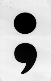
Along with the T-shirt I bought two oval semicolon stickers, one for my car, the other for the semicolon hater in my writers’ group. She accepted hers with grace but promptly drew an international “NO” symbol on it with a red Sharpie.

Anti-semicolonism isn’t rare among writers and even among editors, but I don’t understand it. A writer who favors simple, usually short subject-verb-object sentences will seldom have need of semicolons, but is that any reason to hate them?

I suspect that sometimes anti-semicolonism may be a cover for the fear and loathing of complex sentences: “I hate complex thoughts” sounds rather anti-intellectual, but “I hate semicolons” sounds literarily discerning. To have a strong opinion about semicolons implies that one knows what a semicolon is, and that alone is enough to shut many people up.

As a writer and editor, I love a well-stocked toolkit. Every sentence I encounter, the ones I wrote as well as the ones someone else did, has its own needs. Punctuation marks are tools for shaping sentences, and many sentences can be shaped in different ways. Here’s an example, pulled from an essay of mine: “I’m an editor and writer; without functioning eyes, I can’t work.”

This not especially long or complex sentence could be punctuated in several ways, all of them perfectly correct:

#1: I’m an editor and writer. Without functioning eyes, I can’t work.
#2: I’m an editor and writer: without functioning eyes, I can’t work.
#3: I’m an editor and writer — without functioning eyes, I can’t work.

The first is the most matter-of-fact. To my ear it’s the most staccato, and probably the most emphatic. It leaves the reader to connect the two statements in her own way.

In #2, the colon sets up a cause-and-effect relationship between the two parts of the sentence. The colon suggests because or therefore without adding a word.

The em dash in #3 also conveys cause-and-effect, but more expansively — literally: em dashes take up more space than colons or semicolons and push the elements on either side of it further apart. Like the two-sentence option in #1, an em dash lets the reader make her own connections, but it gives her more room to do it in. To get a feel for em dashery, read a few of Emily Dickinson’s poems the way she wrote them and then with “standard” punctuation imposed. (This was done in some early published versions of Dickinson’s work.)

I read most everything I write aloud. Often I read aloud what I’m editing. I highly recommend the practice. When one reads aloud, the punctuation functions like musical notation: it signals pauses, breaks, and phrasing. I read each of the above options a little differently. In this particular sentence, period + new sentence imposed too much separation between the two thoughts. Neither colon nor dash quite worked because I wanted to downplay the cause-and-effect connection — it’s there, of course, but it’s suggested rather than stated.

Hence option #4:

#4: I’m an editor and writer; without functioning eyes, I can’t work.

Plenty of readers will swear up and down that they read all four sentences exactly the same way and don’t see an iota of difference among them. Some writers will swear likewise. Maybe they’re right, but maybe — at least some of the time — the punctuation works subconsciously.

When I’m reading for pleasure I often don’t notice what punctuation marks the writer has used, or even what word she’s chosen in preference to the various alternatives. When I’m editing, or reviewing, or just rereading to figure out How did she do that? — then I notice. Craft is often self-effacing and invisible to the casual observer, but that doesn’t mean it’s unimportant.

So my toolkit is amply stocked with semicolons, and I keep them near the front where they won’t get lost. If yours drift toward the back, or get buried under commas and dashes and colons, that’s fine with me. But don’t banish them altogether. A writer who eschews semicolons is like a carpenter who doesn’t have a Phillips head screwdriver (several of them!) in her toolbox. Sure, you can often make do with the tools you’ve got, but you can achieve more precision and (dare I say it?) elegance if you’ve got exactly the right tool for the job.

P.S. for semicolon fans: Semicolon T-shirts, mugs, stickers, and tote bag can be had on Cafepress.